


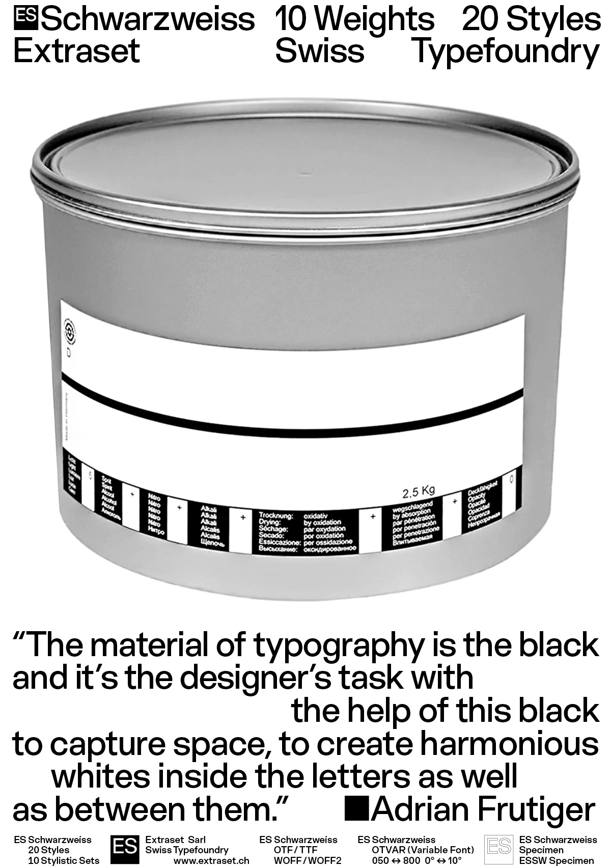
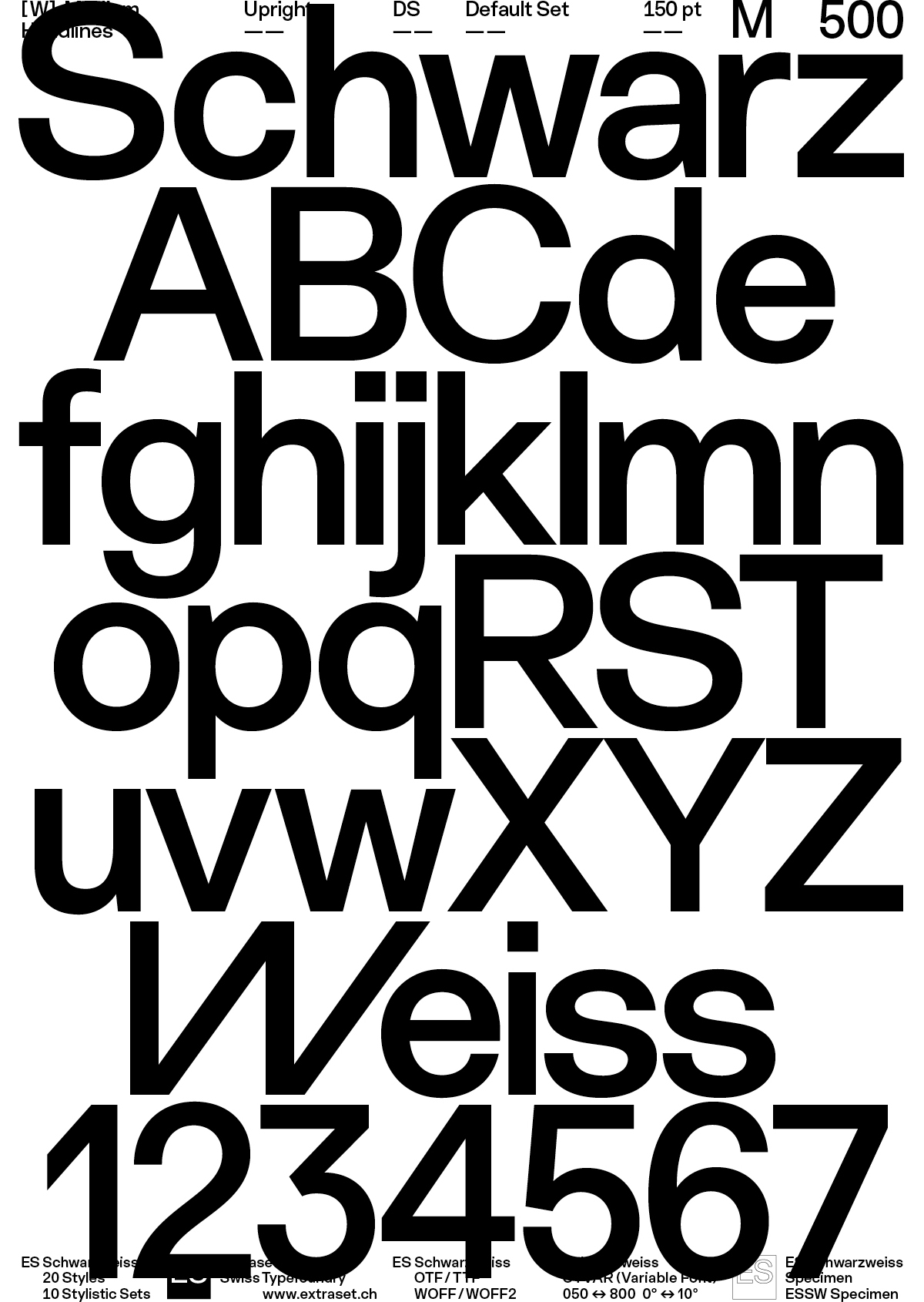
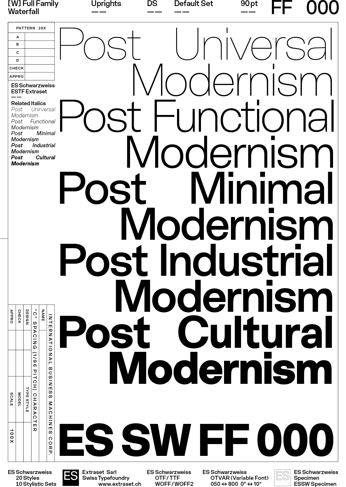
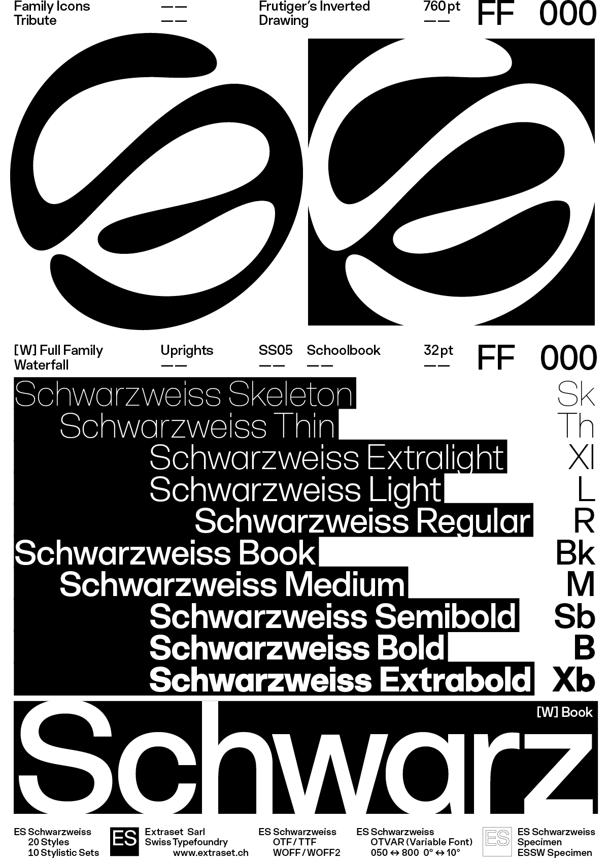
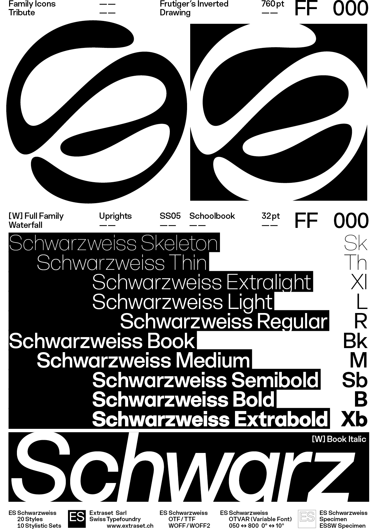
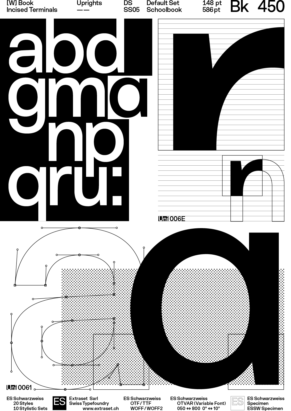
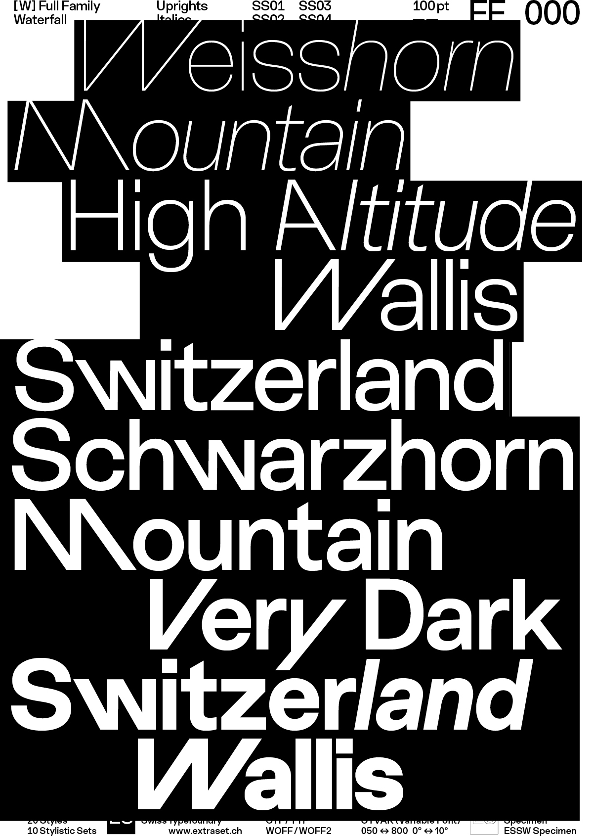
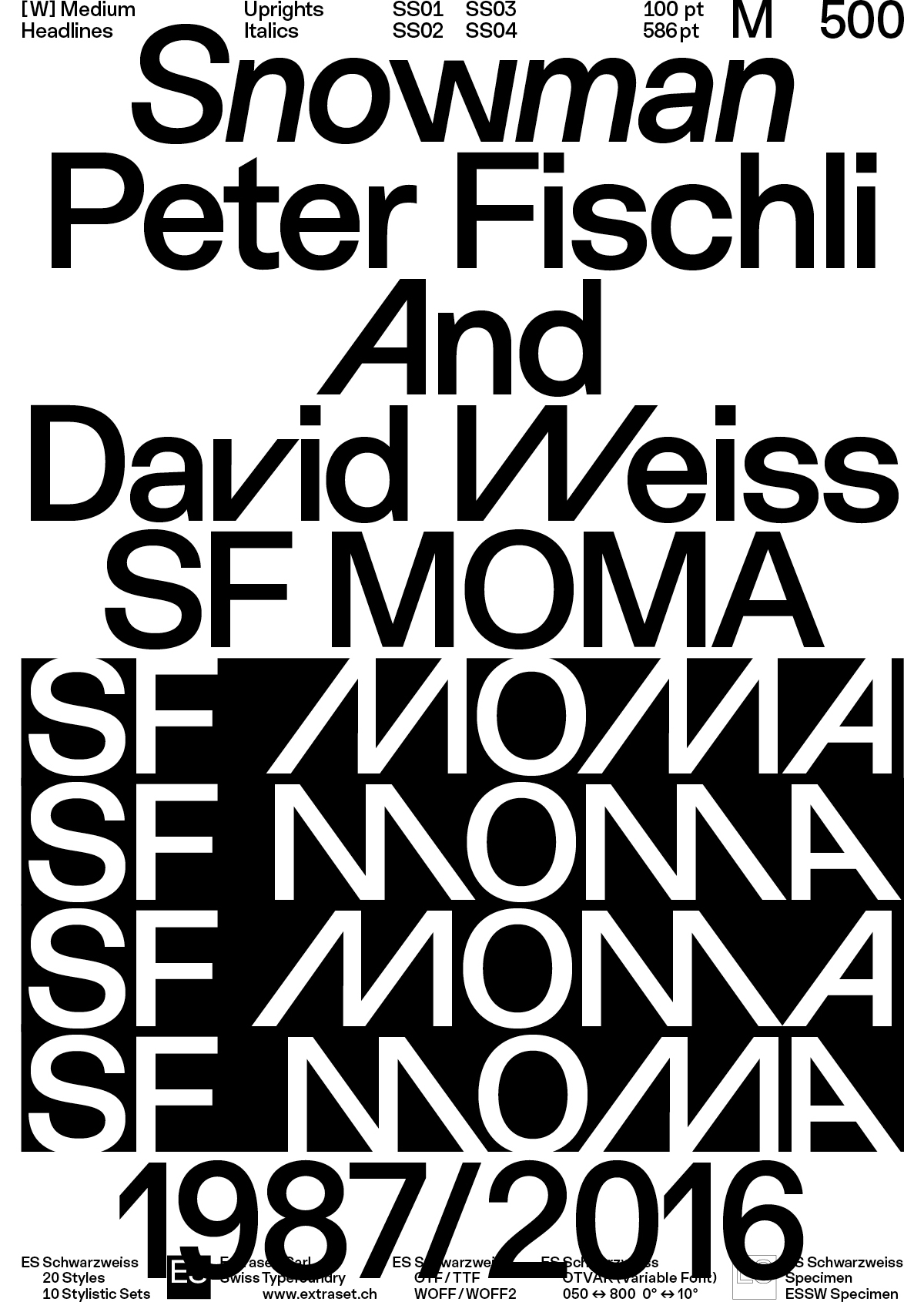
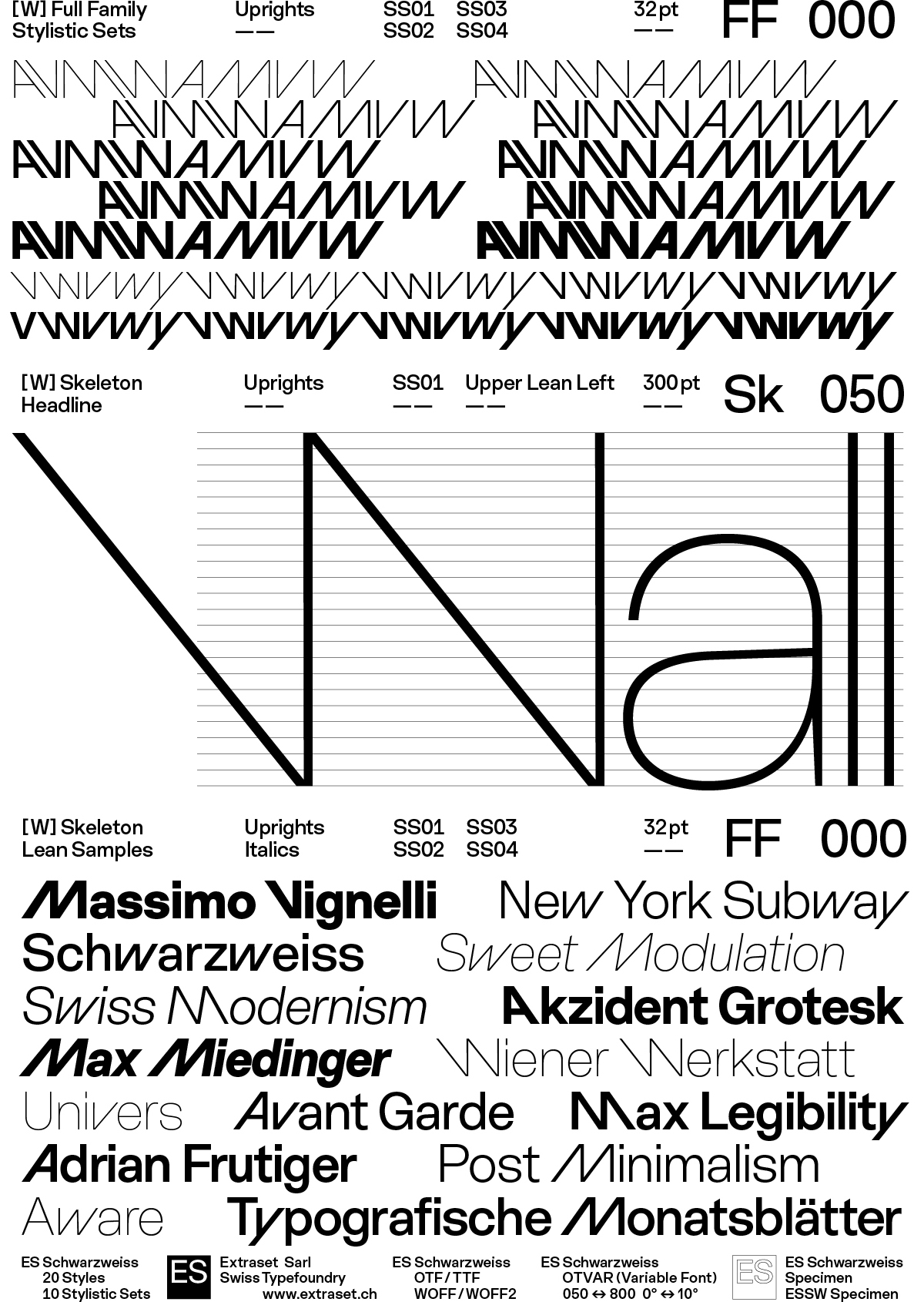
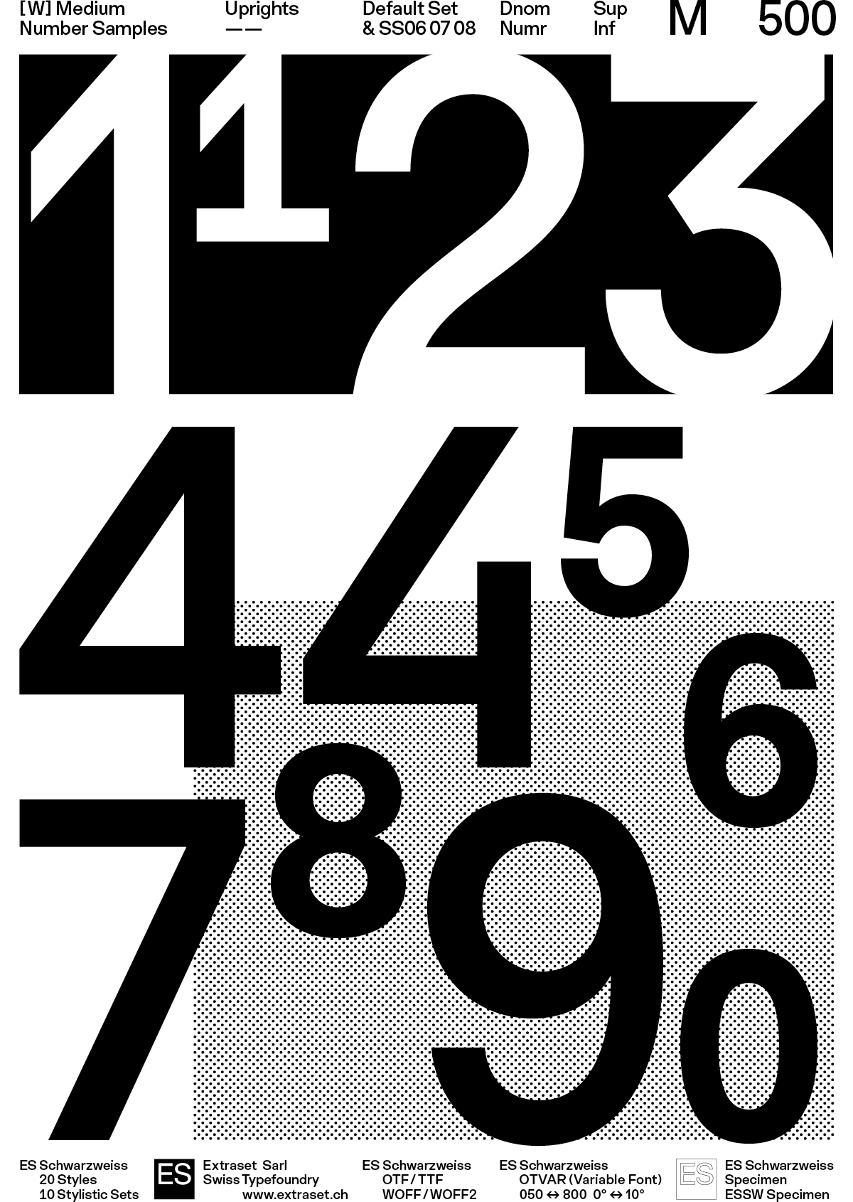
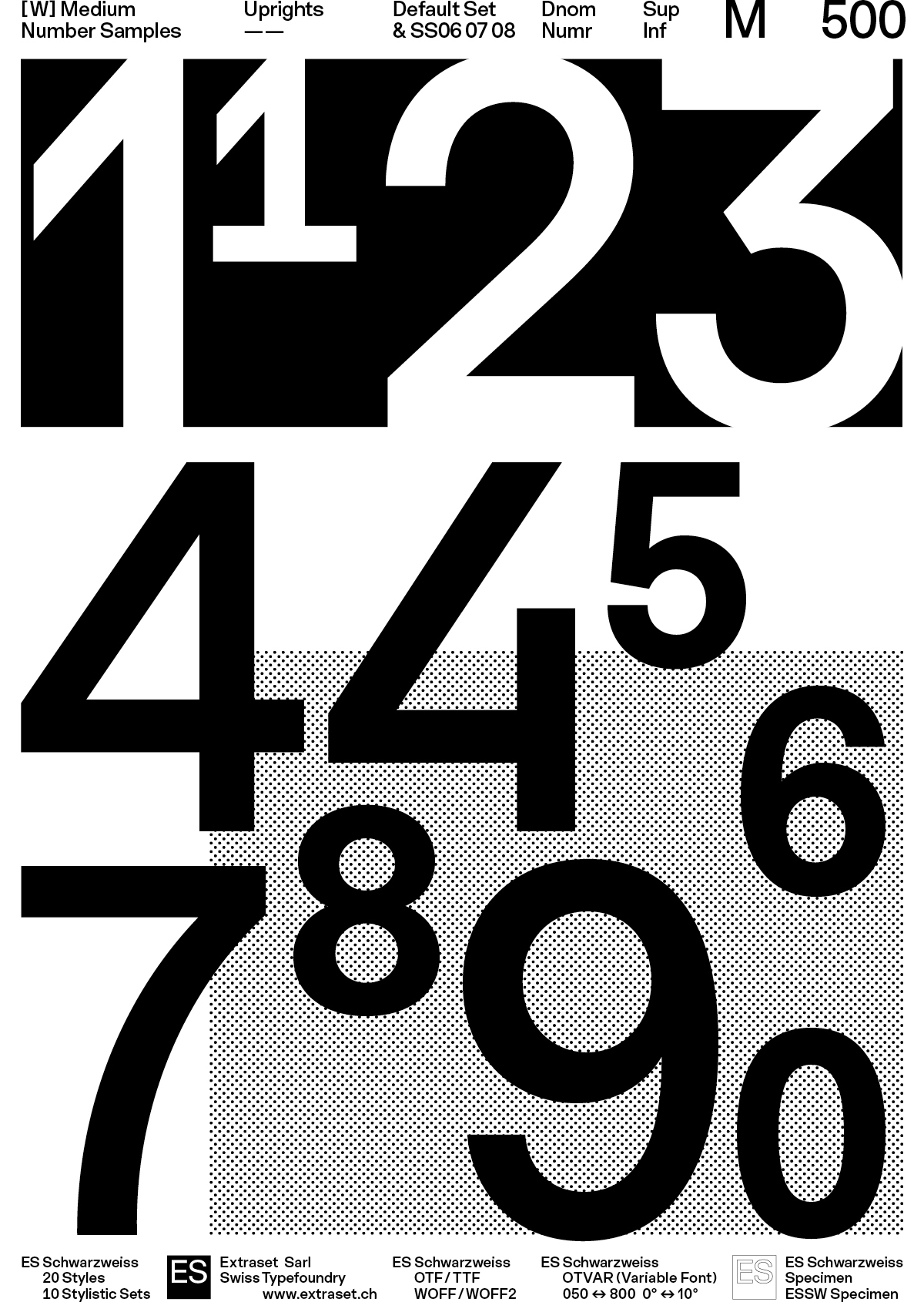
Conceived as an exercise in formal reduction, ES Schwarzweiss tensions the legacy of the Swiss Grotesk genre through an exigent contemporary approach. The drawing approach is rationalized to avoid any optical attraction while reading contents, ensuring a clean and homogeneous contrast across the spectrum. ES Schwarzweiss offers timeless elegance, broad language coverage, and alternative stylistic systems that modulate readability affinities or allow for a more graphic approach to title composition.
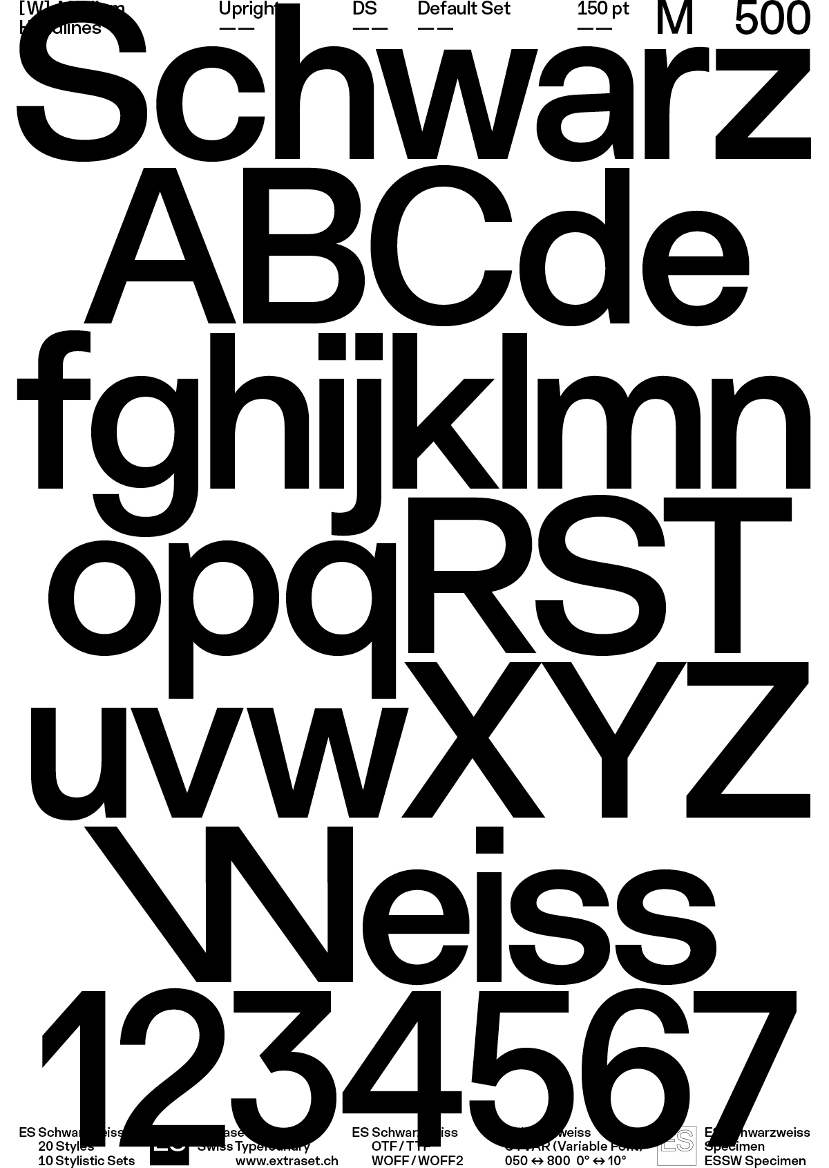
Designed by Alex Dujet, ES Schwarzweiss was intensively tested and refined on several commissioned projects. This typeface has constantly evolved in terms of design as well as the glyphs palette, and this until perfectly reaching the designer’s requirements. Built on solid classical references, each glyph is designed for clarity, visual impact and sophisticated neutrality. The very content below celebrates the authentic atmosphere that has led the designer over the years in conceiving this project.


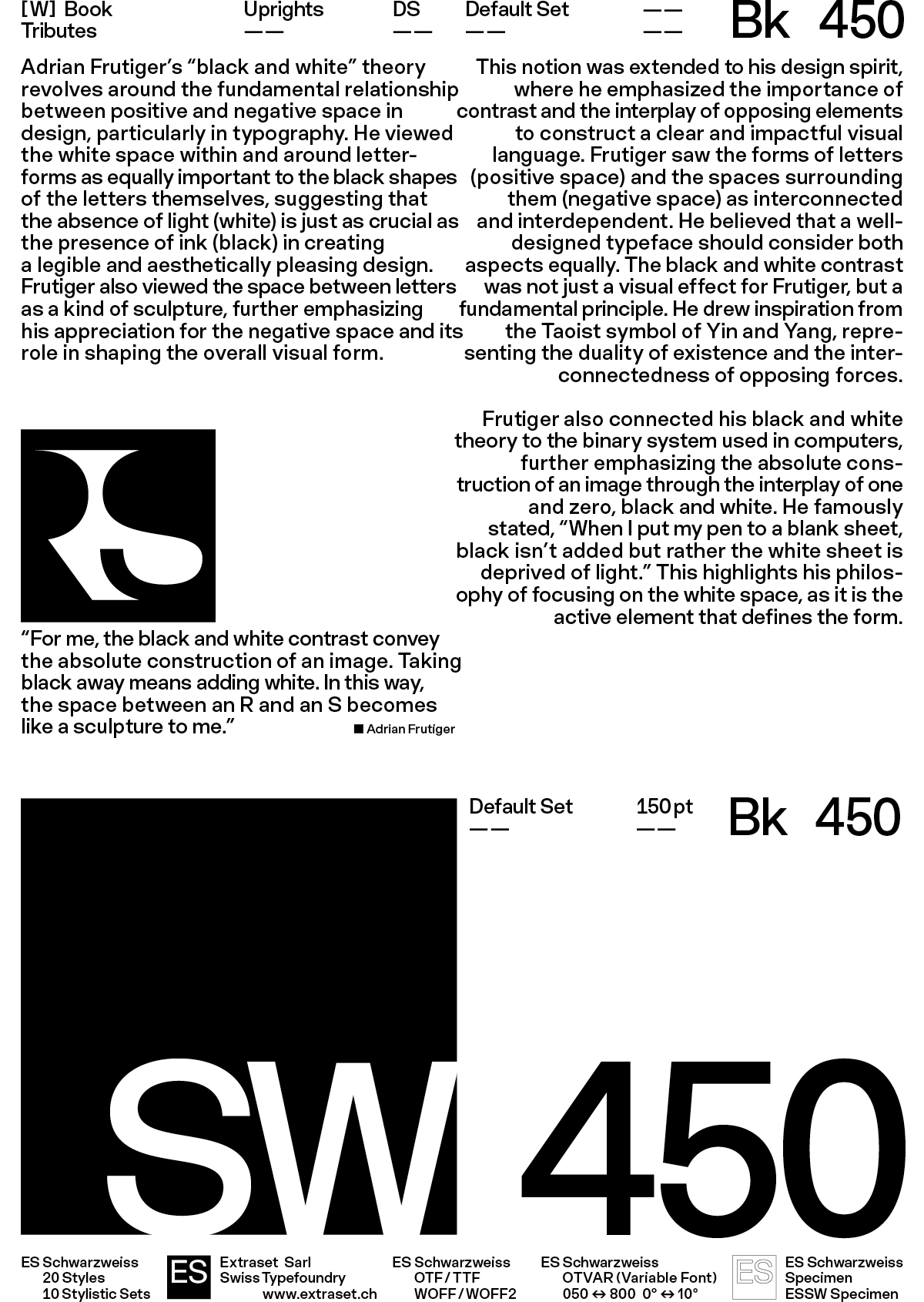
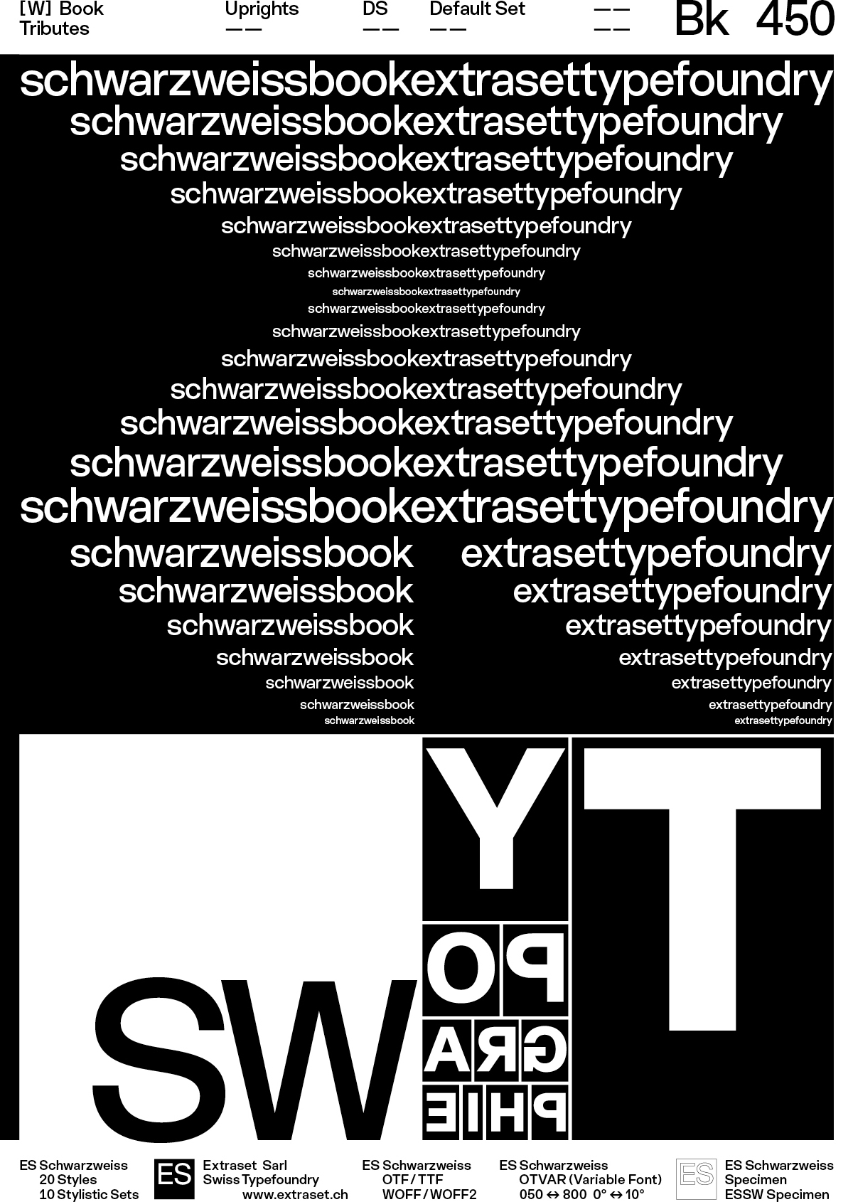
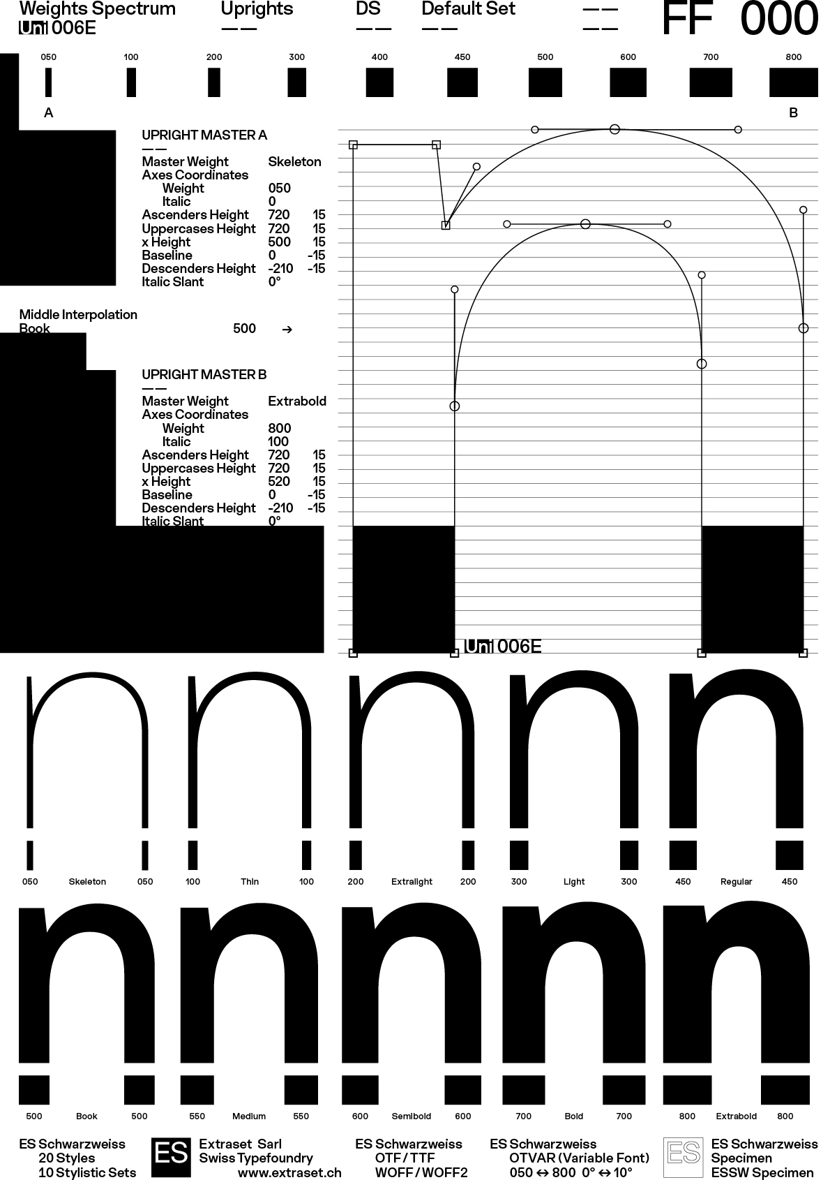
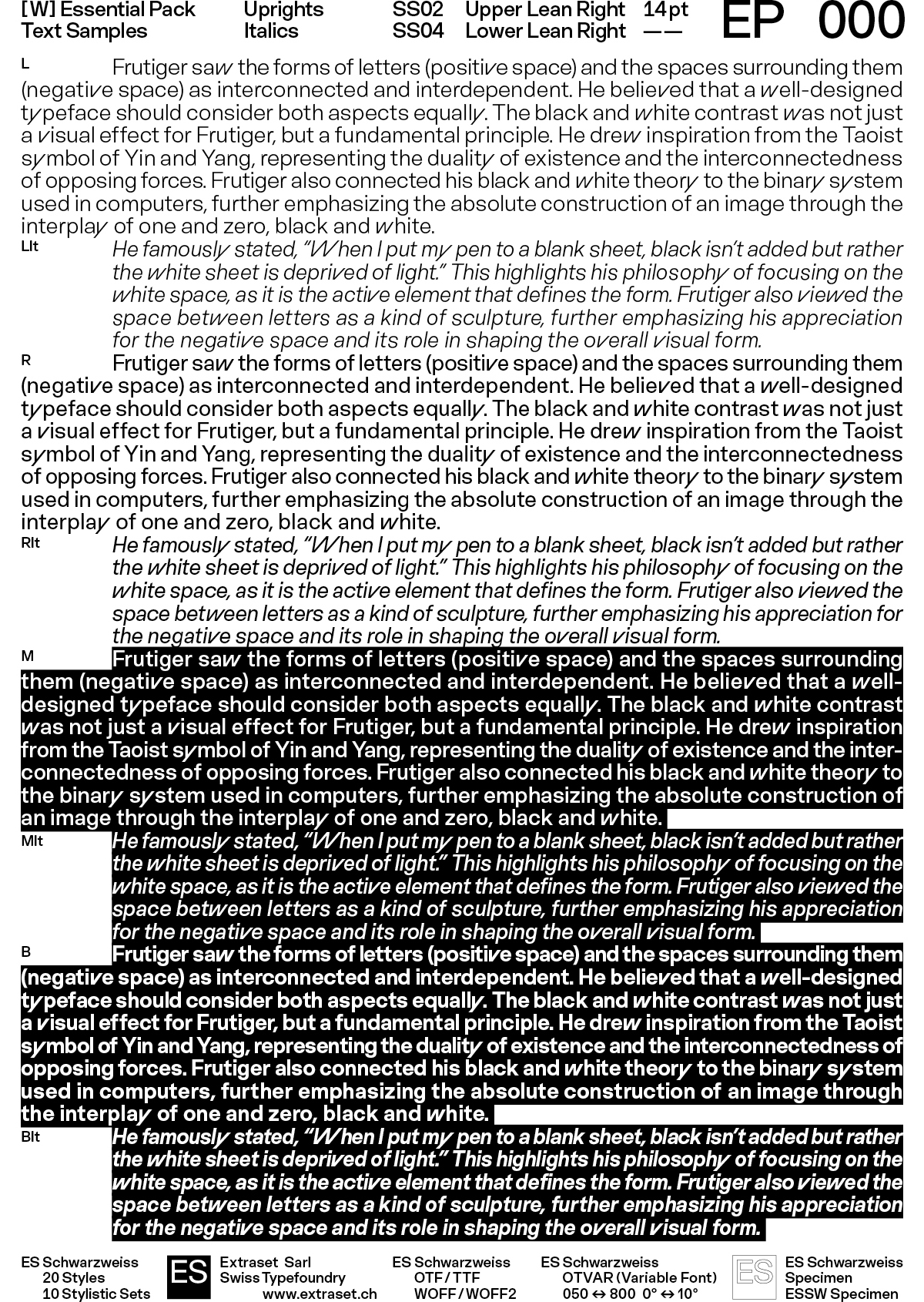
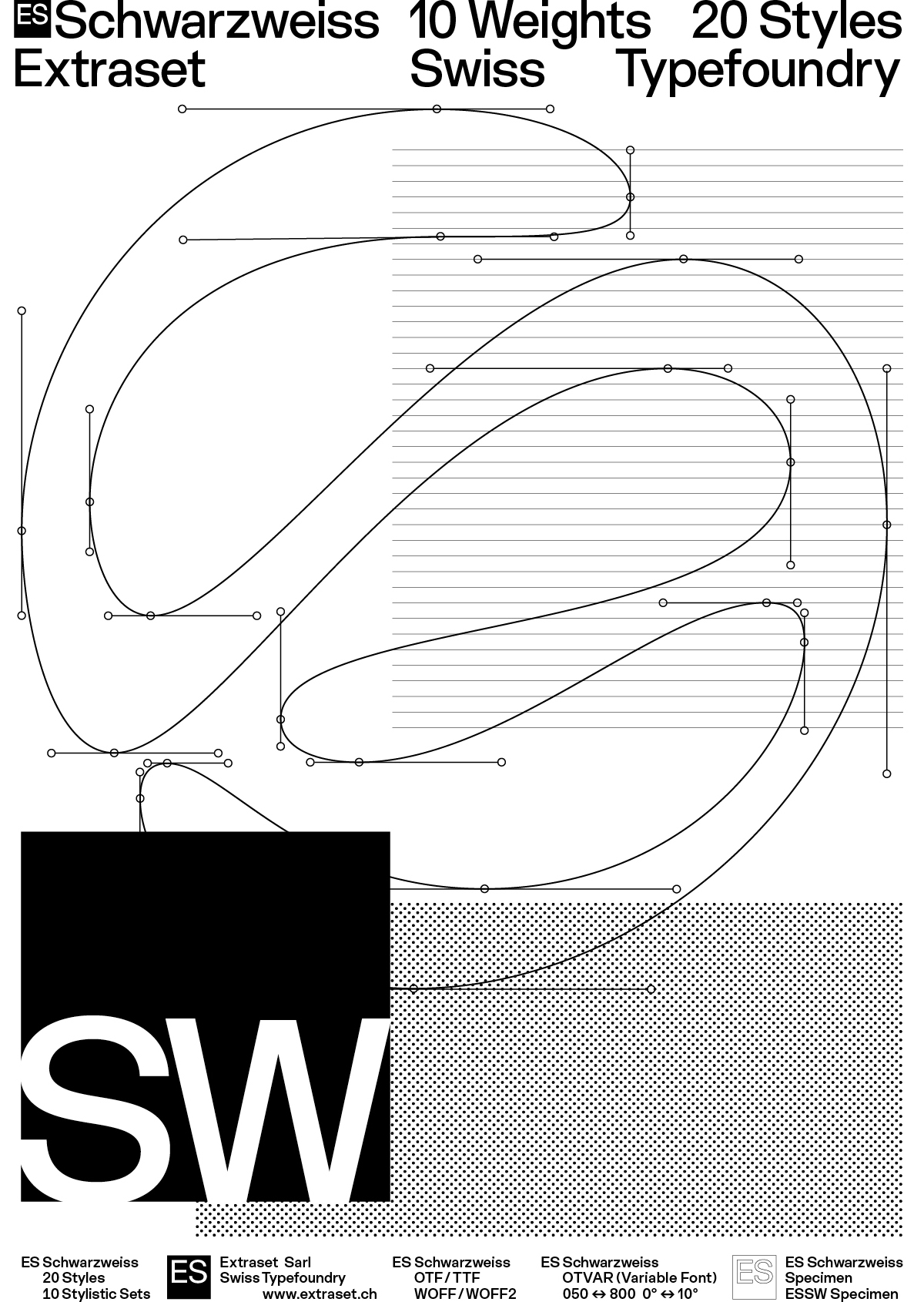
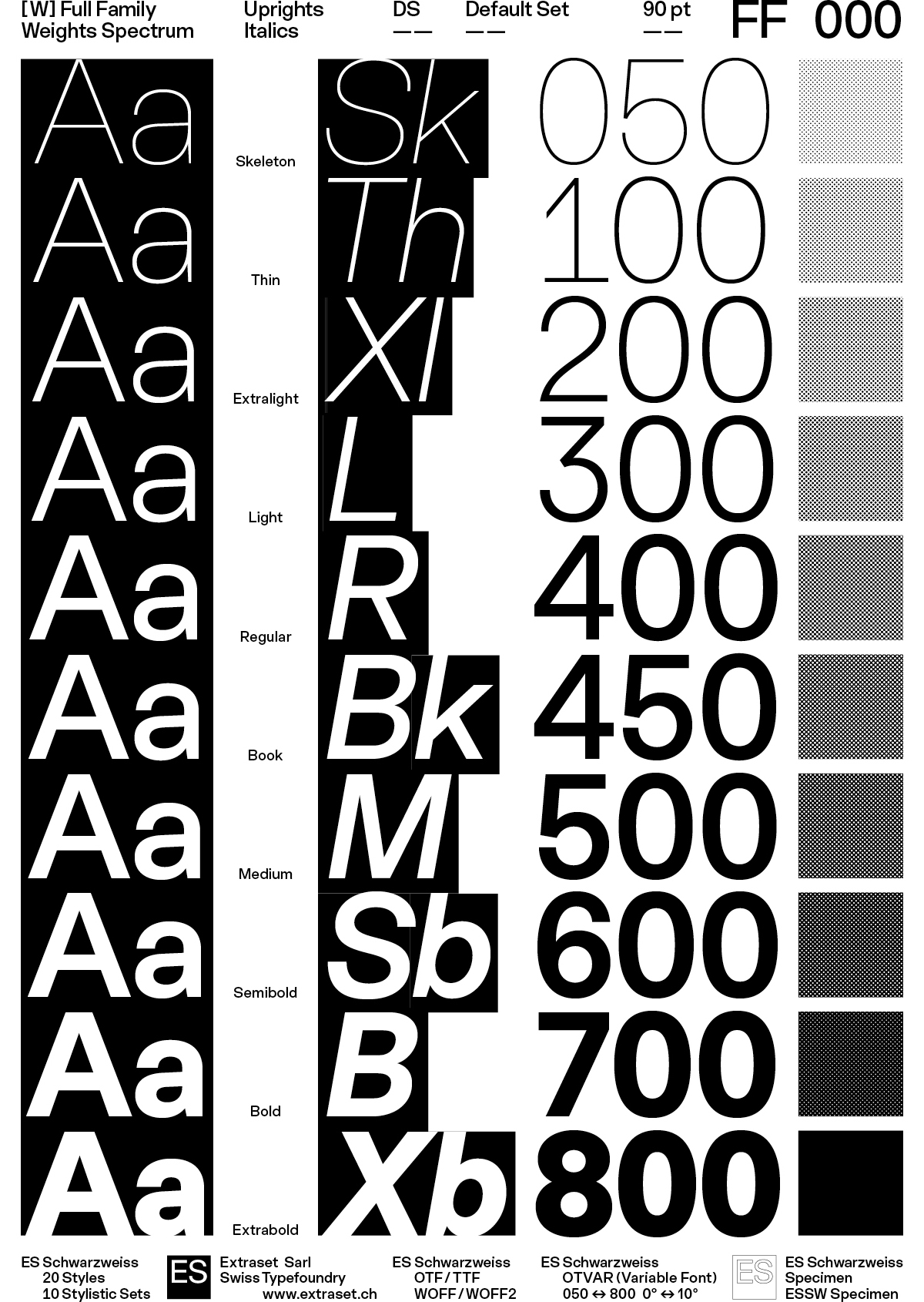
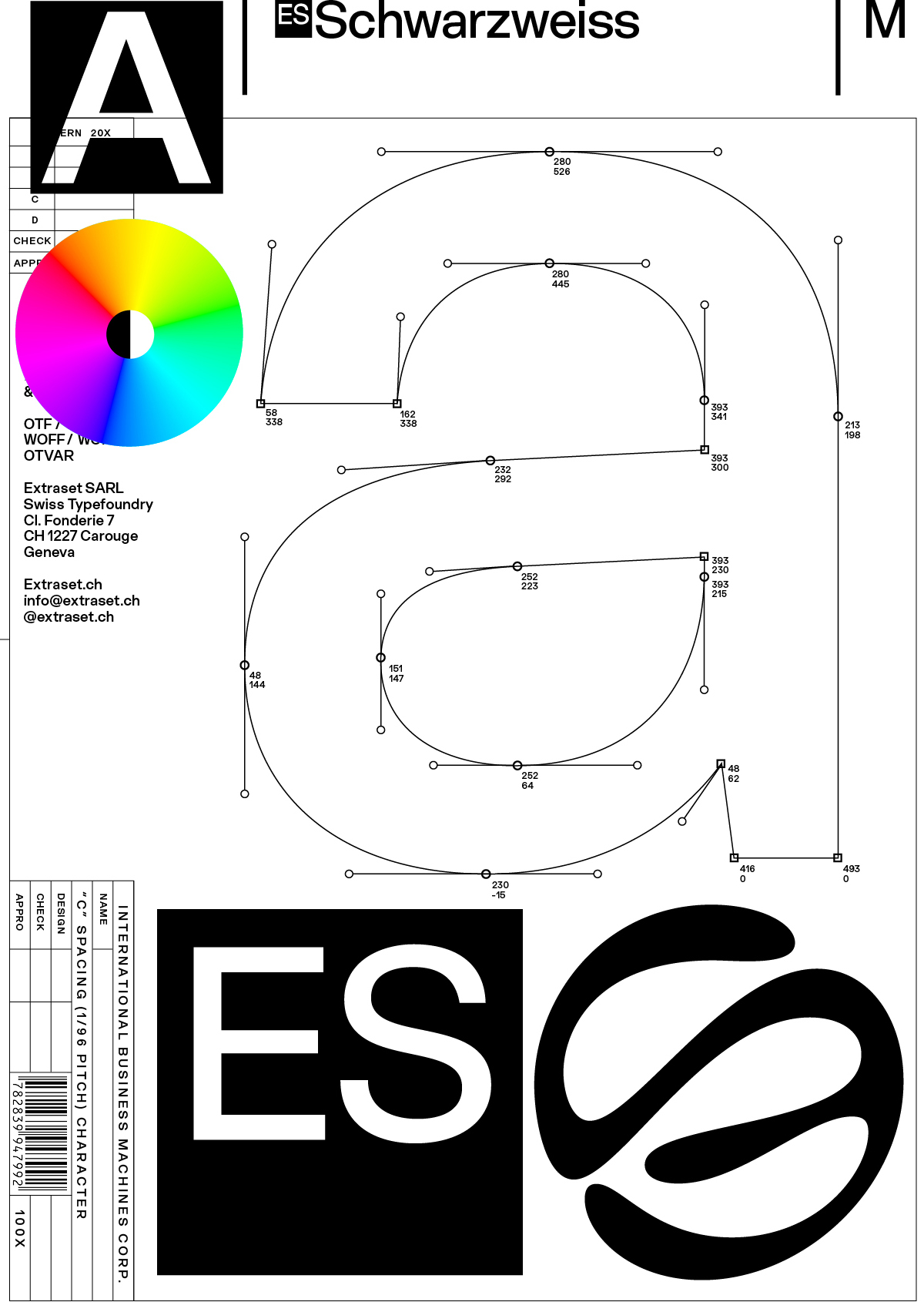
Adrian Frutiger’s “black and white” theory revolves around the fundamental relationship between positive and negative space in design, particularly in typography. He viewed the white space within and around letterforms as equally important to the black shapes of the letters themselves, suggesting that the absence of light (white) is just as crucial as the presence of ink (black) in creating a legible and aesthetically pleasing design. This concept extended to his design philosophy, where he emphasized the importance of contrast and the interplay of opposing elements to construct a clear and impactful visual language. Frutiger saw the forms of letters (positive space) and the spaces surrounding them (negative space) as interconnected and interdependent. He believed that a well-designed typeface should consider both aspects equally.
Adrian Frutiger’s “black and white” theory revolves around the fundamental relationship between positive and negative space in design, particularly in typography. He viewed the white space within and around letterforms as equally important to the black shapes of the letters themselves, suggesting that the absence of light (white) is just as crucial as the presence of ink (black) in creating a legible and aesthetically pleasing design. This concept extended to his design philosophy, where he emphasized the importance of contrast and the interplay of opposing elements to construct a clear and impactful visual language. Frutiger saw the forms of letters (positive space) and the spaces surrounding them (negative space) as interconnected and interdependent. He believed that a well-designed typeface should consider both aspects equally.
Adrian Frutiger’s “black and white” theory revolves around the fundamental relationship between positive and negative space in design, particularly in typography. He viewed the white space within and around letterforms as equally important to the black shapes of the letters themselves, suggesting that the absence of light (white) is just as crucial as the presence of ink (black) in creating a legible and aesthetically pleasing design. This concept extended to his design philosophy, where he emphasized the importance of contrast and the interplay of opposing elements to construct a clear and impactful visual language. Frutiger saw the forms of letters (positive space) and the spaces surrounding them (negative space) as interconnected and interdependent. He believed that a well-designed typeface should consider both aspects equally.
Adrian Frutiger’s “black and white” theory revolves around the fundamental relationship between positive and negative space in design, particularly in typography. He viewed the white space within and around letterforms as equally important to the black shapes of the letters themselves, suggesting that the absence of light (white) is just as crucial as the presence of ink (black) in creating a legible and aesthetically pleasing design. This concept extended to his design philosophy, where he emphasized the importance of contrast and the interplay of opposing elements to construct a clear and impactful visual language. Frutiger saw the forms of letters (positive space) and the spaces surrounding them (negative space) as interconnected and interdependent. He believed that a well-designed typeface should consider both aspects equally.
Adrian Frutiger’s “black and white” theory revolves around the fundamental relationship between positive and negative space in design, particularly in typography. He viewed the white space within and around letterforms as equally important to the black shapes of the letters themselves, suggesting that the absence of light (white) is just as crucial as the presence of ink (black) in creating a legible and aesthetically pleasing design. This concept extended to his design philosophy, where he emphasized the importance of contrast and the interplay of opposing elements to construct a clear and impactful visual language. Frutiger saw the forms of letters (positive space) and the spaces surrounding them (negative space) as interconnected and interdependent. He believed that a well-designed typeface should consider both aspects equally.
Adrian Frutiger’s “black and white” theory revolves around the fundamental relationship between positive and negative space in design, particularly in typography. He viewed the white space within and around letterforms as equally important to the black shapes of the letters themselves, suggesting that the absence of light (white) is just as crucial as the presence of ink (black) in creating a legible and aesthetically pleasing design. This concept extended to his design philosophy, where he emphasized the importance of contrast and the interplay of opposing elements to construct a clear and impactful visual language. Frutiger saw the forms of letters (positive space) and the spaces surrounding them (negative space) as interconnected and interdependent. He believed that a well-designed typeface should consider both aspects equally.
Adrian Frutiger’s “black and white” theory revolves around the fundamental relationship between positive and negative space in design, particularly in typography. He viewed the white space within and around letterforms as equally important to the black shapes of the letters themselves, suggesting that the absence of light (white) is just as crucial as the presence of ink (black) in creating a legible and aesthetically pleasing design. This concept extended to his design philosophy, where he emphasized the importance of contrast and the interplay of opposing elements to construct a clear and impactful visual language. Frutiger saw the forms of letters (positive space) and the spaces surrounding them (negative space) as interconnected and interdependent. He believed that a well-designed typeface should consider both aspects equally.
Adrian Frutiger’s “black and white” theory revolves around the fundamental relationship between positive and negative space in design, particularly in typography. He viewed the white space within and around letterforms as equally important to the black shapes of the letters themselves, suggesting that the absence of light (white) is just as crucial as the presence of ink (black) in creating a legible and aesthetically pleasing design. This concept extended to his design philosophy, where he emphasized the importance of contrast and the interplay of opposing elements to construct a clear and impactful visual language. Frutiger saw the forms of letters (positive space) and the spaces surrounding them (negative space) as interconnected and interdependent. He believed that a well-designed typeface should consider both aspects equally.

Post Universal Setting
Machines Corp. 0004
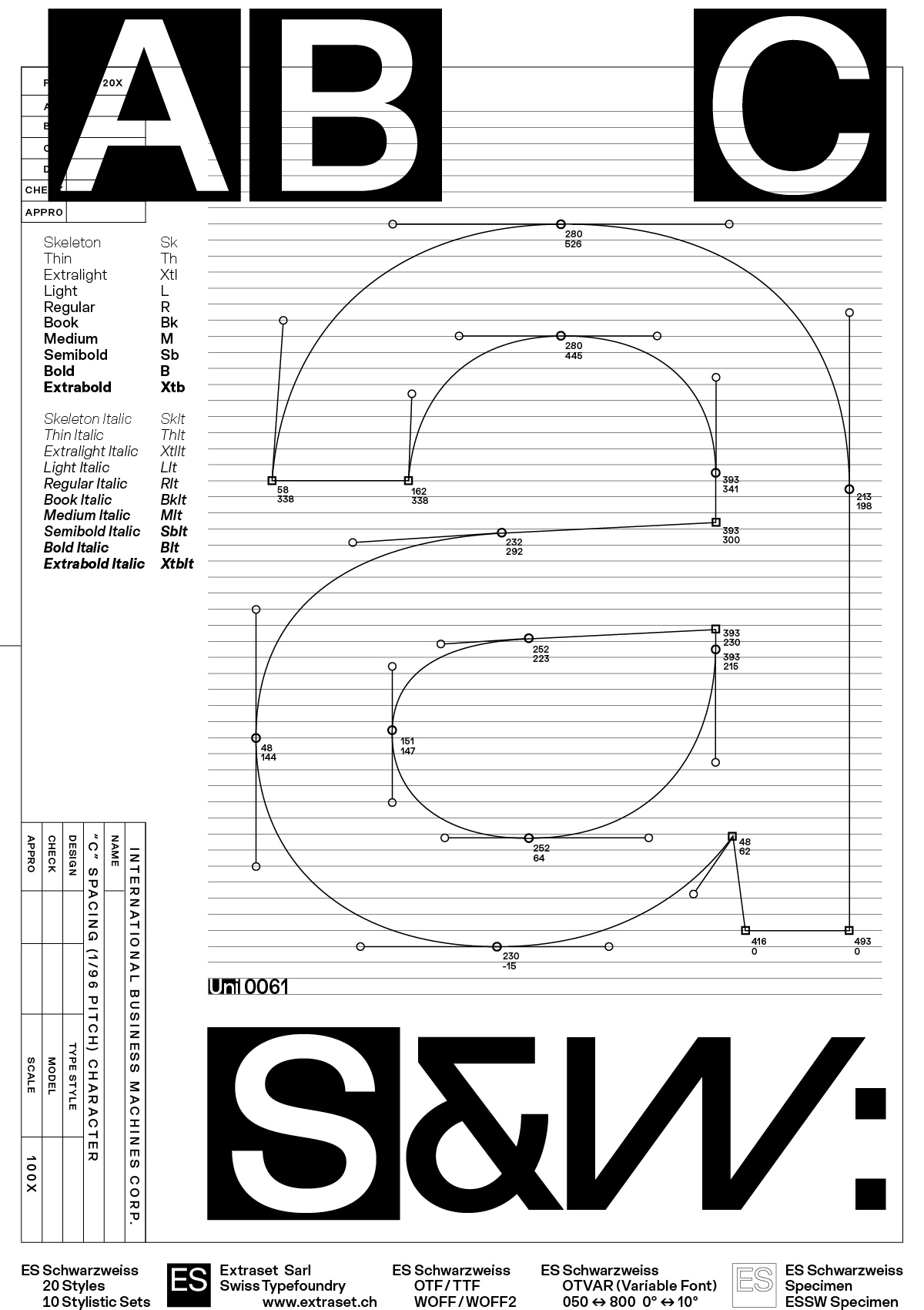
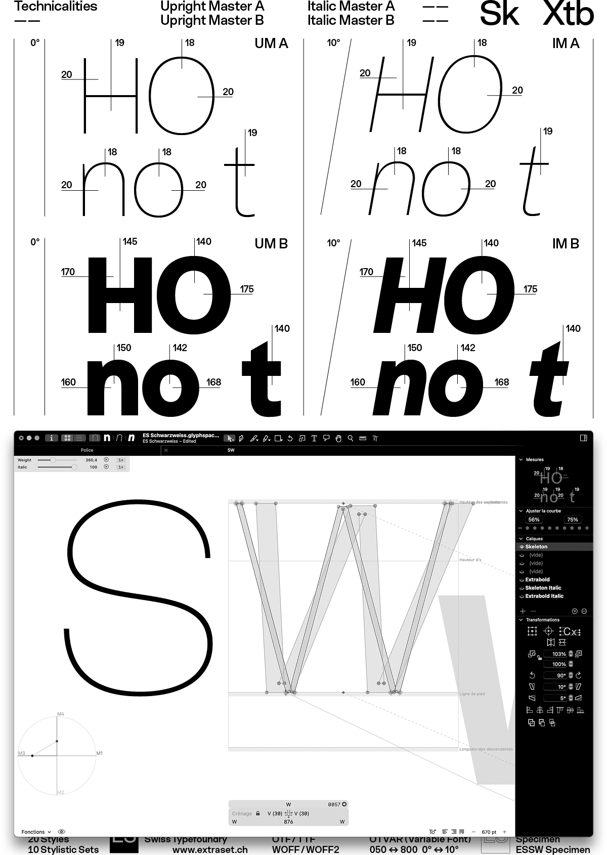
Spacing (1/96 Pitch) 1227*
Power Work System
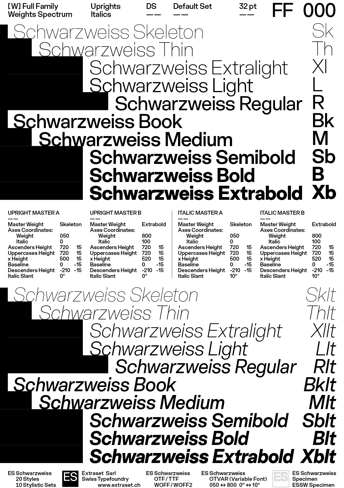
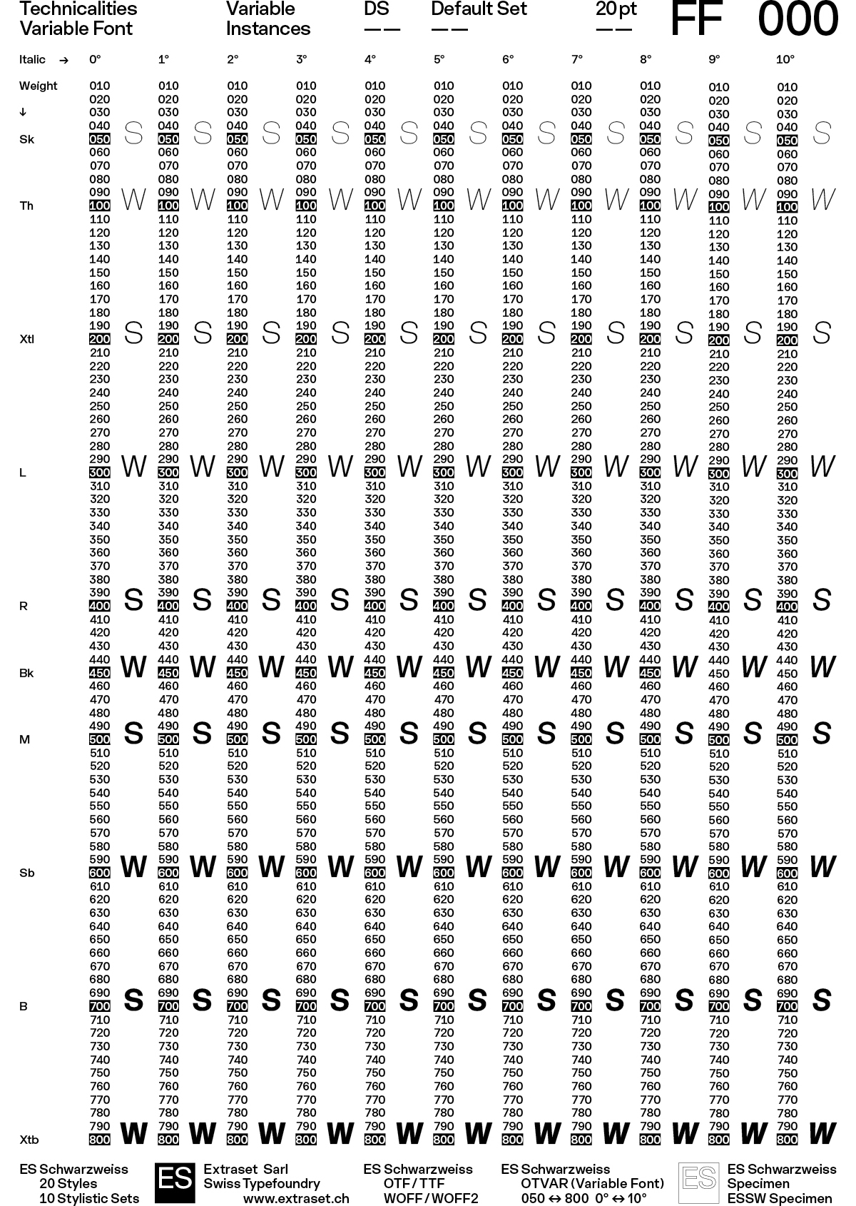
Multiset & Variable Font
- Italic
- Width
- Weights
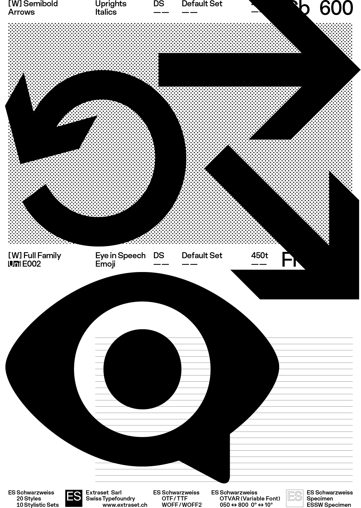
A Á Ă Ắ Ặ Ằ Ẳ Ẵ Ǎ  Ấ Ậ Ầ Ẩ Ẫ Ä Ạ À Ả Ā Ą Å Ã A Á Ă Ắ Ặ Ằ Ẵ Ǎ  Ậ Ầ Ẩ Ẫ Ä Ạ À Ả Ā Ą Å Å A Á Ă Ắ Ặ Ằ Ẵ Ǎ  Ậ Ầ Ẩ Ẫ Ä Ạ À Ả Ā Ą Å Å Æ B C Ć Č Ç Ĉ Ċ D Ð Ď Đ E É Ĕ Ě Ê Ế Ệ Ề Ể Ễ Ë Ė Ẹ È Ẻ Ē Ę Ẽ F Ƒ G Ğ Ǧ Ĝ Ģ Ġ G Ğ Ǧ Ĝ Ģ Ġ H Ħ Ĥ I IJ Ĭ Ǐ Î Ï İ Ị Ì Ỉ Ī Į Ĩ J Ĵ K Ķ L Ĺ Ľ Ļ Ŀ Ł M N Ń Ň Ņ Ŋ Ñ O Ó Ŏ Ǒ Ô Ố Ộ Ồ Ổ Ỗ Ö Ọ Ò Ỏ Ơ Ớ Ợ Ờ Ở Ỡ Ő Ō Ø Õ Œ P Þ Q R Ŕ Ř Ŗ S Ś Š Ş Ŝ Ș ẞ Ə T Ŧ Ť Ţ Ț U Ú Ŭ Ǔ Û Ü Ǘ Ǚ Ǜ Ǖ Ụ Ù Ủ Ư Ứ Ự Ừ Ử Ữ Ű Ū Ų Ů Ũ V V V W W W Ẃ Ŵ Ẅ Ẁ Ẃ Ŵ Ẅ Ẁ Ẃ Ŵ Ẅ Ẁ X Y Ý Ŷ Ÿ Ỵ Ỳ Ỷ Ȳ Ỹ Z Ź Ž Ż a á ă ắ ặ ằ ẳ ẵ ǎ â ấ ậ ầ ẩ ẫ ä ạ à ả ā ą å ã a á ă ắ ặ ằ ẳ ẵ ǎ â ấ ậ ầ ẩ ẫ ä ạ à ả ā ą å ã æ b c ć č ç ĉ ċ d ð ď đ d ď đ e é ĕ ě ê ế ệ ề ể ễ ë ė ẹ è ẻ ē ę ẽ ə f g ğ ǧ ĝ ģ ġ h ħ ĥ i ı í ĭ ǐ î ï ị ì ỉ ij ī į ĩ j ȷ ĵ k ķ k ķ k ķ l ĺ ľ ļ ŀ ł m n ń ň ņ ŋ ñ o ó ŏ ǒ ô ố ộ ồ ổ ỗ ö ọ ò ỏ ơ ớ ợ ờ ở ỡ ő ō ø õ œ p þ q r ŕ ř ŗ s ś š ş ŝ ș ß t ŧ ť ţ ț u ú ŭ ǔ û ü ǘ ǚ ǜ ǖ ụ ù ủ ư ứ ự ừ ử ữ ű ū ų ů ũ v w w w ẃ ŵ ẅ ẁ ẃ ŵ ẅ ẁ ẃ ŵ ẅ ẁ x y ý ŷ ÿ ỵ ỳ ỷ ȳ ỹ y ý ŷ ÿ ỵ ỳ ỷ ȳ ỹ z ź ž ż fi fl ff ft ffi ffl fft ª º ª Δ Ω 0 1 2 2 3 4 4 5 6 7 7 8 9 ⁰ ¹ ² ² ³ ⁴ ⁴ ⁵ ⁶ ⁷ ⁷ ⁸ ⁹ ⁄ ½ ¼ ¾ ⅔ ¼ ⅖ ⅛ ⅜ ⅝ ⅞ , : ; … ! ¡ ? ¿ · • * # / \ ( ) { } [ ] - – — _ ‚ „ “ ” ‘ ’ « » ‹ › " ' ¢ ¤ $ € ƒ ₺ ₽ £ ¥ + − × ÷ = ≠ > < ≥ ≤ ± ≈ ¬ ~ ^ ∞ ∫ Ω ∆ ∏ ∑ √ µ ∂ % ‰ ↑ ↗ → ↘ ↓ ↙ ← ↖ ↰ ↱ ↲ ↳ ⇆ ⇆ ⟲ ⟳ ◊ @ & & & ¶ § © ℗ ® ™ ° | ¦ † ‡ ℮ №
A Á Ă Ắ Ặ Ằ Ẳ Ẵ Ǎ  Ấ Ậ Ầ Ẩ Ẫ Ä Ạ À Ả Ā Ą Å Ã A Á Ă Ắ Ặ Ằ Ẵ Ǎ  Ậ Ầ Ẩ Ẫ Ä Ạ À Ả Ā Ą Å Å A Á Ă Ắ Ặ Ằ Ẵ Ǎ  Ậ Ầ Ẩ Ẫ Ä Ạ À Ả Ā Ą Å Å Æ B C Ć Č Ç Ĉ Ċ D Ð Ď Đ E É Ĕ Ě Ê Ế Ệ Ề Ể Ễ Ë Ė Ẹ È Ẻ Ē Ę Ẽ F Ƒ G Ğ Ǧ Ĝ Ģ Ġ G Ğ Ǧ Ĝ Ģ Ġ H Ħ Ĥ I IJ Ĭ Ǐ Î Ï İ Ị Ì Ỉ Ī Į Ĩ J Ĵ K Ķ L Ĺ Ľ Ļ Ŀ Ł M N Ń Ň Ņ Ŋ Ñ O Ó Ŏ Ǒ Ô Ố Ộ Ồ Ổ Ỗ Ö Ọ Ò Ỏ Ơ Ớ Ợ Ờ Ở Ỡ Ő Ō Ø Õ Œ P Þ Q R Ŕ Ř Ŗ S Ś Š Ş Ŝ Ș ẞ Ə T Ŧ Ť Ţ Ț U Ú Ŭ Ǔ Û Ü Ǘ Ǚ Ǜ Ǖ Ụ Ù Ủ Ư Ứ Ự Ừ Ử Ữ Ű Ū Ų Ů Ũ V V V W W W Ẃ Ŵ Ẅ Ẁ Ẃ Ŵ Ẅ Ẁ Ẃ Ŵ Ẅ Ẁ X Y Ý Ŷ Ÿ Ỵ Ỳ Ỷ Ȳ Ỹ Z Ź Ž Ż a á ă ắ ặ ằ ẳ ẵ ǎ â ấ ậ ầ ẩ ẫ ä ạ à ả ā ą å ã a á ă ắ ặ ằ ẳ ẵ ǎ â ấ ậ ầ ẩ ẫ ä ạ à ả ā ą å ã æ b c ć č ç ĉ ċ d ð ď đ d ď đ e é ĕ ě ê ế ệ ề ể ễ ë ė ẹ è ẻ ē ę ẽ ə f g ğ ǧ ĝ ģ ġ h ħ ĥ i ı í ĭ ǐ î ï ị ì ỉ ij ī į ĩ j ȷ ĵ k ķ k ķ k ķ l ĺ ľ ļ ŀ ł m n ń ň ņ ŋ ñ o ó ŏ ǒ ô ố ộ ồ ổ ỗ ö ọ ò ỏ ơ ớ ợ ờ ở ỡ ő ō ø õ œ p þ q r ŕ ř ŗ s ś š ş ŝ ș ß t ŧ ť ţ ț u ú ŭ ǔ û ü ǘ ǚ ǜ ǖ ụ ù ủ ư ứ ự ừ ử ữ ű ū ų ů ũ v w w w ẃ ŵ ẅ ẁ ẃ ŵ ẅ ẁ ẃ ŵ ẅ ẁ x y ý ŷ ÿ ỵ ỳ ỷ ȳ ỹ y ý ŷ ÿ ỵ ỳ ỷ ȳ ỹ z ź ž ż fi fl ff ft ffi ffl fft ª º ª Δ Ω 0 1 2 2 3 4 4 5 6 7 7 8 9 ⁰ ¹ ² ² ³ ⁴ ⁴ ⁵ ⁶ ⁷ ⁷ ⁸ ⁹ ⁄ ½ ¼ ¾ ⅔. ¼ ⅖ ⅛ ⅜ ⅝ ⅞. , : ; … ! ¡ ? ¿ · • * # / \ ( ) { } [ ] - – — _ ‚ „ “ ” ‘ ’ « » ‹ › " ' ¢ ¤ $ € ƒ ₺ ₽ £ ¥ + − × ÷ = ≠ > < ≥ ≤ ± ≈ ¬ ~ ^ ∞ ∫ Ω ∆ ∏ ∑ √ µ ∂ % ‰ ↑ ↗ → ↘ ↓ ↙ ← ↖ ↰ ↱ ↲ ↳ ⇆ ⇆ ⟲ ⟳ ◊ @ & & & ¶ § © ℗ ® ™ ° | ¦ † ‡ ℮ №
Language Coverage
Basic Latin-1 / Mac Roman
Latin Extended-A,
Western Europe, Central Europe,
South-West Europe,
Vietnamese, Pinyin
Abenaki, Afaan Oromo, Afar, Afrikaans, Albanian, Alsatian, Amis, Anuta, Aragonese, Aranese, Aromanian, Arrernte, Arvanitic, Asturian, Atayal, Aymara, Azerbaijani, Bashkir, Basque, Belarusian, Bemba, Bikol, Bislama, Bosnian, Breton, Bulgarian Romanization, Cape Verdean, Catalan, Cebuano, Chamorro, Chavacano, Chichewa, Chickasaw, Chinese Pinyin, Cimbrian, Cofan, Cornish, Corsican, Creek, Crimean Tatar, Croatian, Czech, Danish, Dawan, Delaware, Dholuo, Drehu, Dutch, English, Esperanto, Estonian, Faroese, Fijian, Filipino, Finnish, Folkspraak, French, Frisian, Friulian, Gagauz, Galician, Ganda, Genoese, German, Gikuyu, Gooniyandi, Greenlandic, Guadeloupean, Gwichin, Haitian Creole, Han, Hawaiian, Hiligaynon, Hopi, Hotcak, Hungarian, Icelandic, Ido, Igbo, Ilocano, Indonesian, Interglossa, Interlingua, Irish, Istroromanian, Italian, Jamaican, Javanese, Jerriais, Kaingang, Kala Lagaw Ya, Kapampangan, Kaqchikel, Karakalpak, Karelian, Kashubian, Kikongo, Kinyarwanda, Kiribati, Kirundi, Klingon, Kurdish, Ladin, Latin, Latino Sine, Latvian, Lithuanian, Lojban, Lombard, Low Saxon, Luxembourgish, Maasai, Makhuwa, Malay, Maltese, Manx, Maori, Marquesan, Meglenoromanian, Meriam Mir, Mirandese, Mohawk, Moldovan, Montagnais, Montenegrin, Murrinhpatha, Nagamese Creole, Nahuatl, Ndebele, Neapolitan, Ngiyambaa, Niuean, Noongar, Norwegian, Novial, Occidental, Occitan, Oshiwambo, Ossetian, Palauan, Papiamento, Piedmontese, Polish, Portuguese, Potawatomi, Qeqchi, Quechua, Rarotongan, Romanian, Romansh, Rotokas, Sami Inari, Sami Lule, Sami Northern, Sami Southern, Samoan, Sango, Saramaccan, Sardinian, Scottish Gaelic, Serbian, Seri, Seychellois, Shawnee, Shona, Sicilian, Silesian, Slovak, Slovenian, Slovio, Somali, Sorbian Lower, Sorbian Upper, Sotho Northern, Sotho Southern, Spanish, Sranan, Sundanese, Swahili, Swazi, Swedish, Tagalog, Tahitian, Tetum, Tok Pisin, Tokelauan, Tongan, Tshiluba, Tsonga, Tswana, Tumbuka, Turkish, Turkmen, Tuvaluan, Tzotzil, Uzbek, Venetian, Vepsian, Vietnamese, Volapuk, Voro, Wallisian, Walloon, Waraywaray, Warlpiri, Wayuu, Welsh, Wikmungkan, Wiradjuri, Wolof, Xavante, Xhosa, Yapese, Yindjibarndi, Zapotec, Zazaki, Zulu, Zuni